Stem and Leaf Plot
The Stem and Leaf plot is used to display categorical (discrete) or variable data. The stems are groups of data by class intervals. The leaves are smaller increments of each data point that are built onto the stems
They were most popular in the 1980's and were often done by hand with manageable amounts of data. Since most software programs can handle large amounts of data, there are more informational types of graphical methods used. The Stem and Leaf plot is used less frequently today.
This plot can be created where the stem is shown as the left column and the leaves in the right column which would show the distribution in a "horizontal" manner. Or it can be created where the stem is created along the bottom and the leaves built on top which would show the distribution in a "vertical" manner. Either method will get the same result just shown in a different orientation.
Stem and Leaf Plot Example
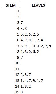
Plot the following 41 data points and make observations on the distribution: The data was collected but not necessary in order by sequence.
56, 37, 52, 43, 131, 48, 84, 78, 134, 88, 137, 64, 123, 141, 148, 56, 79, 80, 97, 67, 60, 61, 86, 67, 52, 71, 70, 82, 52, 70, 64, 128, 139, 142, 72, 127, 131, 137, 77, 150,79.
It appears there is two modes and both modes taking on the shape of a normal distribution which is referred to as bimodal. It doesn't appear there are any outliers if there are two modes occurring.
The team should investigate how the data is getting recorded, who, machines, parts, measuring devices, and other inputs that are leading to this. By looking at only the numerical data it is not as obvious to see, but once it is graphed it is simple to spot and fix early in the process.
Once the modes are understood and possibly separated or eliminated then normality assumptions may apply allowing easier assessment of process capability and a benchmark z-score can be created.
It doesn't matter that each data point is plotted in sequence, any order will still give the shape the same appearance at the end. However, what is required to give the shape its proper scaling, is the entry of the leaves must take the same amount of space.
For example, if the amount of spacing between the 3 and 8 (to the right of the stem 4) was extended due to careless recording on a board then it might give the wrong appearance of the shape.
3,8 looks different than 3, 8.
Since these are typically done by hand, it can become time consuming and messy with large sets of data. Remember each data point is represented numerically.
For larger sets of data, a cleaner graphical method that also quickly shows a lot of insight is a box plot (fixed width, variable width, or notched) or a histogram.
A histogram can lose the individual values of the data whereas this plot retains most of (often all) the raw numerical data. These plots can provide a quick snapshot on the distribution of the data and expose outliers. Another advantage is the Stem and Leaf plot shows at least two significant digits.
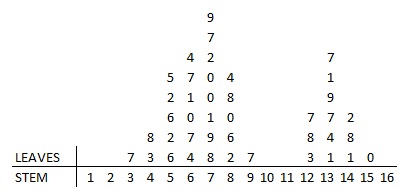
The other method of creating the stem and leaf plot is shown with the same data.
A stem and leaf plot is different than a histograms in the sense that it retains the original data to at least two significant digits, and put the data in order.
It is similar to a histogram in that is helps visualize the shape of the data distribution. You can quickly observe left or right skewness, or possibly bi-modal behavior. You can see the data plotted above appears to have a bi-modal distribution.
It also can help identify outliers and the mode of the data. These plots can have negative values as stems.
In summary, these plots are no longer used very often. They were used as a quick method to visualize a histogram and the distribution shape to identify outliers or bimodal conditions. Then further effort would be taken to test for normality with probability plots (which are also done in most all statistical software programs).
Return to the Six-Sigma-Material Home page
Recent Articles
-
Process Capability Indices
Oct 18, 21 09:32 AM
Determing the process capability indices, Pp, Ppk, Cp, Cpk, Cpm -
Six Sigma Calculator, Statistics Tables, and Six Sigma Templates
Sep 14, 21 09:19 AM
Six Sigma Calculators, Statistics Tables, and Six Sigma Templates to make your job easier as a Six Sigma Project Manager -
Six Sigma Templates, Statistics Tables, and Six Sigma Calculators
Aug 16, 21 01:25 PM
Six Sigma Templates, Tables, and Calculators. MTBF, MTTR, A3, EOQ, 5S, 5 WHY, DPMO, FMEA, SIPOC, RTY, DMAIC Contract, OEE, Value Stream Map, Pugh Matrix

Site Membership
LEARN MORE
Six Sigma
Templates, Tables & Calculators
Six Sigma Slides
Green Belt Program (1,000+ Slides)
Basic Statistics
Cost of Quality
SPC
Process Mapping
Capability Studies
MSA
SIPOC
Cause & Effect Matrix
FMEA
Multivariate Analysis
Central Limit Theorem
Confidence Intervals
Hypothesis Testing
T Tests
1-Way ANOVA
Chi-Square
Correlation
Regression
Control Plan
Kaizen
MTBF and MTTR
Project Pitfalls
Error Proofing
Z Scores
OEE
Takt Time
Line Balancing
Yield Metrics
Sampling Methods
Data Classification
Practice Exam
... and more
Need a Gantt Chart?
