P-Chart
Attribute (Discrete) Control Charts
A P-Chart is an attribute control chart used when plotting:
- DEFECTIVES
- BINOMIAL ASSUMPTIONS SATISFIED
- VARIABLE SAMPLE (SUBGROUP) SIZE (will also plot constant sample size)
Each observation is independent. The word "defective" is also sometime referred to as "nonconforming". The P-Chart is also referred to as a control chart for fraction nonconforming.
The purpose is to develop upper and lower control limits (UCL and LCL) and determine performance of process over time. This chart plots the proportion (fraction, percent) of defective units in a constant or variable size sample.
This is the most sensitive and commonly used attribute control chart.
The variable sample size should each be of a size to have the likelihood that it contains at least one defect. If the defective level is very low, (sample size * average % defective < 5), then apply binomial distribution exact limits. The chart should not be applied if one defect puts the process out of control.
The chart is normally used to detect shifts >1.5 standard deviations. In order to detect smaller and quicker shifts there are other charts for variable and attribute data such as Exponentially Weighted Moving Average (EWMA) and Cumulative Sum of Quality Characteristic Measurement (CUSUM). These are referred to as time-weighted moving charts.
The P-chart is displayed as a fraction (or % or proportion).
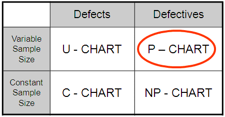
- The C chart displays the number of defects
- The U chart displays the number of defects per unit
- The NP chart displays the number of defectives
For P charts, the subgroup size may vary but they should each be >50.
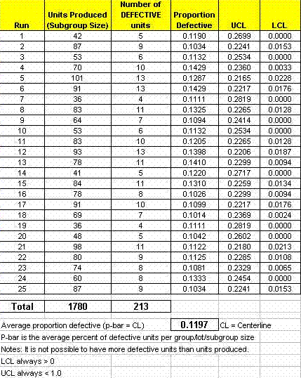
Below is a sample set of data which will help illustrate the creation of the P-chart, its centerline and control limits.
 Six-Sigma-Material.com
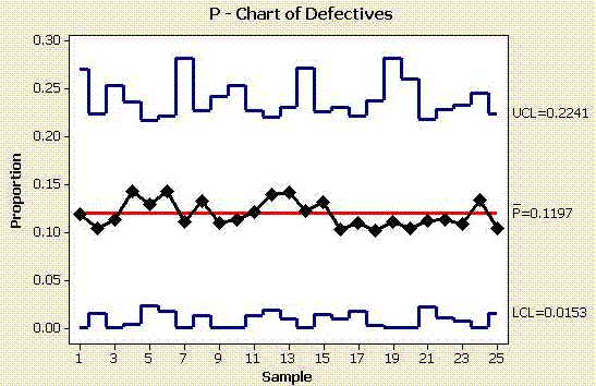
From the data set above the following graph is produced. Many statistical programs offer a variety of options for establishing the limits and centerline descriptions.
 Six-Sigma-Material.com
The average proportion of defective units (not defects) is 11.97%. Based on the control limits, the process "voice" is telling us that it is expected that between 1.53% and 22.41% of the units will be defective each run.
Review of other attribute control charts:
Site Membership
Click for a Password
to access entire site
Six Sigma
Templates & Calculators
Six Sigma Modules
The following are available
Click Here
Green Belt Program (1,000+ Slides)
Basic Statistics
Cost of Quality
SPC
Process Mapping
Capability Studies
MSA
Cause & Effect Matrix
FMEA
Multivariate Analysis
Central Limit Theorem
Confidence Intervals
Hypothesis Testing
T Tests
1-Way ANOVA
Chi-Square
Correlation and Regression
Control Plan
Kaizen
MTBF and MTTR
Project Pitfalls
Error Proofing
Effective Meetings
OEE
Takt Time
Line Balancing
Practice Exam
... and more


