EWMA Chart
Exponentially Weighted Moving Average Chart
EWMA Charts is a type of a Moving Average chart that is typically used when plotting continuous (can apply to attributes data) data to detect small changes over a small period of time.
This chart detects small shifts of 0.5 - 2.0 sigma faster than Xbar and I-MR charts but are slower in detecting larger shifts in the process mean than Xbar and I-MR charts.
The moving average smooths the variation of time therefore should not be used when looking for a point that is outside of the process control limits.
EWMA must have a smoothing constant (alpha or damping factor) which is a value set by the user. The smaller the alpha, the smoother the curve. The higher the alpha the more the chart will behave like a I or Xbar chart. Typical values are 0.1 to 0.3.
There are several variations of moving average, also called a "rolling average" or "running average. There are other charting types listed below in addition to EMWA that use a central tendency to highlight longer term fluctuations and trends, rather than short term. In other words, they give less and less weight to earlier data as more data is gathered.
- Simple moving average
- Cumulative moving average (such as CUSUM)
- Weighted moving average
- Moving median
These calculations analyze data points by creating a series of averages of different subsets of the full data set. A moving average chart is commonly used with time series data to smooth out short-term fluctuations and help identify longer-term trends or cycles.
The data must be obtained and plotted in sequential order. The data can be in subgroups or individual measurements. Since the data is smoothed it is used to predict performance in the next period of change or instability.
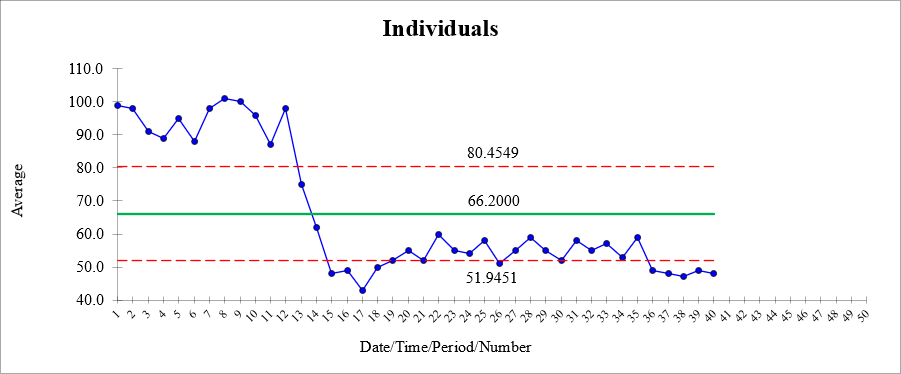
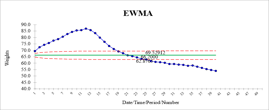
See the I-Chart and EWMA with the same data plotted below an alpha of 0.1.
Notice the large drop from data point 12 to 13 and several thereafter took a long time for the EWMA chart to move downward. The I-chart reacted immediately.
Notice the smoothing is very gradual and almost all points are outside the LCL and UCL which is not very useful.


Most statistical software programs the capability and may offer the option to enter various "memory" and weight values. The most recent data point is given the most weight and as time progresses the weight of the older points decreases.
The term exponentially means that the weights of the older points decrease exponentially with time. Recall that CUSUM charts use equals weights for previous data points.
These charts are applicable when a I-MR or X-bar & R control chart appears out of control due to "wear" over time as would be the case on perishable tooling or dies, a saw blade, or a grinding wheel..
Assumptions
This chart plots variable data and assumes a normal distribution; however, the chart is also fairly reliable with non-normal distributed data.
Why not just use an I-MR or X-bar & R chart?
The I-MR and X-bar & R chart are used under the assumption that the mean is constant and observations are independent.
Tools and dies are going to wear and shifts in the performance are expected and this may be common cause variation in reality but showing up as special cause.
When the tool or die is replaced or adjusted, the control chart would exhibit the same pattern as before. This is case where there is correlation between consecutive points and the assumption of independent measurements is most likely violated.
In this case, the EWMA chart could show the pattern and make replacement schedules more predictable before there is a failure.
One note of caution is the EWMA chart monitors only the process mean other methods must be used to evaluate process variability.
Control Limits
The control limits can be calculated for EWMA charts but the formula is complex (not discussed here) and can be used in estimation or predictor of future performance.
Applications
This chart (or other moving averages) is frequently used in stock modeling software packages for analysts trying to predict the next day performance based on the last couple weeks or months of performance.
Stock price values are most often not totally independent observations as each day is based on a previous performance and outside factors and are often correlated between successive dates.
EWMA and CUSUM
Both accumulate information from successive readings and signal a change when a shift occurs, even if the change is relatively small so that a Shewhart Xbar or I-MR chart fails to detect it or fails to detect change as fast as a EMWA or CUSUM would detect the change.
Both types of charts are generally equally accepted options so pick one and move forward.
The two charts are sensitive in detecting minor but gradual shifts in a process that may not actually be out-of-control as shown if using a I-MR or Xbar chart.
Search for Six Sigma related jobs
Site Membership
Click for a Password
to access entire site
Six Sigma
Templates & Calculators
Six Sigma Modules
The following are available
Click Here
Green Belt Program (1,000+ Slides)
Basic Statistics
Cost of Quality
SPC
Process Mapping
Capability Studies
MSA
Cause & Effect Matrix
FMEA
Multivariate Analysis
Central Limit Theorem
Confidence Intervals
Hypothesis Testing
T Tests
1-Way ANOVA
Chi-Square
Correlation and Regression
Control Plan
Kaizen
MTBF and MTTR
Project Pitfalls
Error Proofing
Effective Meetings
OEE
Takt Time
Line Balancing
Practice Exam
... and more


